Web accessibility for developers: a practical WCAG 2.2 guide
Around one in six people lives with a significant disability — and accessible sites work better for everyone. Here’s what WCAG 2.2 asks for, the issues that matter most, and how to build and test accessible interfaces in everyday work.
 Nasir Mollah
5 min read
On this page14 sections
Accessibility is often treated as a compliance checkbox for large organizations. It’s much more than that. The World Health Organization estimates that around 1.3 billion people — about one in six — live with a significant disability. Add temporary situations (a broken arm, bright sunlight on a phone screen, a noisy train) and age-related changes, and accessibility affects nearly everyone at some point.
Accessible websites are also simply better websites: clearer, faster to use, easier for search engines to understand, and more robust across devices. And in many places there are legal requirements too — for example ADA-related lawsuits in the US and the European Accessibility Act, which applies to many products and services sold in the EU since June 2025.
This guide covers what you need to know as a developer, focusing on the issues that matter most in practice.
WCAG in one minute
The Web Content Accessibility Guidelines (WCAG) are the international standard. The current version, WCAG 2.2, is organized around four principles — content must be:
- Perceivable — people can see, hear or otherwise perceive it;
- Operable — people can use it with a keyboard, touch, voice or switch devices;
- Understandable — content and interactions make sense;
- Robust — it works with assistive technologies like screen readers.
Each guideline has success criteria at levels A, AA and AAA. Most laws and policies target level AA.
1. Start with semantic HTML
The single most effective accessibility technique is using the right HTML element for the job. Native elements come with keyboard support, focus behavior and meaning for assistive technology — for free.
<!-- ❌ Looks like a button, isn't one -->
<div class="btn" onclick="save()">Save</div>

<!-- ✅ Focusable, works with Enter and Space, announced as a button -->
<button type="button" onclick="save()">Save</button>
Use real structure too:
- one
<h1>per page and a logical heading hierarchy (h2,h3…) — screen-reader users navigate by headings; - landmarks:
<header>,<nav>,<main>,<footer>; - lists for lists, tables for tabular data;
<a>for navigation,<button>for actions.
2. Make everything work with a keyboard
Many people navigate without a mouse — using a keyboard, switch device or voice control.
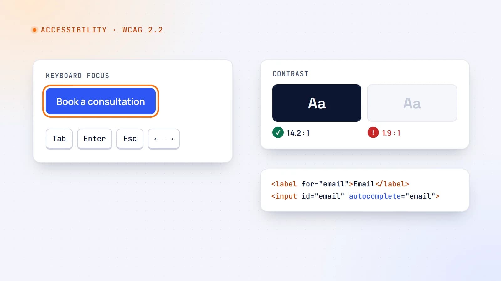
- Every interactive element must be reachable with Tab and operable with Enter/Space (and arrow keys where expected, such as in tabs and menus).
- The tab order should follow the visual order.
- Avoid keyboard traps: dialogs and menus must be closable with Escape, and focus should return to where it was.
- Add a “Skip to content” link so keyboard users don’t tab through the whole navigation on every page.
The quickest test you can do today: put your mouse away and try to use your site.
3. Visible focus — and not hidden
Keyboard users need to see where they are. Never remove focus outlines without replacing them:
/* ❌ Don't */
*:focus { outline: none; }

/* ✅ Clear, consistent focus style for keyboard users */
:focus-visible {
  outline: 3px solid #1e5e5a;
  outline-offset: 2px;
}
WCAG 2.2 adds that focused elements shouldn’t be obscured — for example hidden behind a sticky header or cookie banner.
4. Color contrast
Low-contrast text is one of the most common failures. Level AA requires:
- 4.5:1 contrast for normal text;
- 3:1 for large text (roughly 24px, or 19px bold);
- 3:1 for user-interface components and meaningful graphics, such as input borders and icons.
Also, never use color alone to convey meaning. An error shown only as a red border fails people who can’t distinguish red; add an icon and a text message.
5. Images and media
- Give meaningful images an
alttext that conveys their purpose:alt="Therapist Anna Keller smiling in her office". - Use empty
alt=""for decorative images so screen readers skip them. - For complex images (charts, diagrams), summarize the key point in text nearby.
- Provide captions for videos and transcripts for audio.
6. Forms that everyone can complete
Forms are where accessibility problems cost real conversions.
<label for="email">Email address</label>
<input id="email" name="email" type="email" autocomplete="email" required
       aria-describedby="email-hint email-error" aria-invalid="true" />
<p id="email-hint">We’ll only use this to reply to you.</p>
<p id="email-error">Please enter a valid email address, like name@example.com.</p>
- Every input needs a visible label (placeholders aren’t labels).
- Use the right input type and
autocompletevalues so browsers and password managers can help. - Explain errors in text, next to the field, and say how to fix them.
- After a failed submit, move focus to an error summary or the first invalid field.
- WCAG 2.2 also asks you not to make people re-enter information they’ve already provided in the same process, and not to rely on cognitive tests (like memorizing or transcribing) for login without an alternative.
7. Target size and touch
WCAG 2.2 introduces a minimum target size of 24×24 CSS pixels for clickable things (with some exceptions such as inline links). In practice, aim for about 44×44px for primary controls — it’s kinder to everyone using a phone.
8. ARIA: use it carefully
ARIA attributes add accessibility information when HTML alone can’t express it: aria-expanded on a menu toggle, aria-live for status messages, aria-current="page" in navigation.
The first rule of ARIA: don’t use ARIA if a native element does the job. Incorrect ARIA is worse than none, because it tells assistive technology something false.
<button aria-expanded="false" aria-controls="menu">Menu</button>
<p role="status" aria-live="polite">Message sent.</p>
9. Motion, zoom and reflow
- Respect
prefers-reduced-motion: tone down or remove non-essential animation for people who get dizzy or distracted by it. - Don’t auto-play moving content without a way to pause it.
- Content must work at 200% zoom and reflow on narrow screens without horizontal scrolling.
- Don’t disable pinch-zoom on mobile.
@media (prefers-reduced-motion: reduce) {
  *, *::before, *::after { animation: none !important; transition: none !important; }
}
10. Clear content
Accessibility isn’t only technical. Plain language, descriptive link text (“Read the pricing guide” rather than “Click here”), consistent navigation and meaningful page titles help people with cognitive disabilities — and every busy visitor.
How to test
No single tool catches everything. Combine:
- Automated checks — axe DevTools, Lighthouse or similar. They quickly catch contrast, missing labels and alt text, and invalid ARIA (roughly a third of issues).
- Keyboard testing — navigate every page and flow without a mouse.
- Screen reader testing — NVDA (Windows, free), VoiceOver (macOS and iOS) or TalkBack (Android). Listen to how your forms and navigation are announced.
- Zoom and mobile checks — 200% zoom, small screens, landscape orientation.
- Automated tests in CI — tools like axe can run against key pages in end-to-end tests so regressions are caught before release.
Make it part of the process
Accessibility is far cheaper to build in than to retrofit:
- Choose accessible component libraries — and check them.
- Include accessibility criteria in design reviews and pull requests.
- Add automated checks to CI.
- Test real flows (sign-up, booking, checkout) with a keyboard and a screen reader before launch.
The takeaway
Accessible websites are built from habits, not heroics: semantic HTML, keyboard support, visible focus, enough contrast, labeled forms, careful ARIA and respect for user preferences. Do these consistently and you’ll meet most of WCAG 2.2 AA — and build a site that works better for every single visitor.
- Accessibility
- Web Development
- React
- Code Quality
Keep reading
5 min read
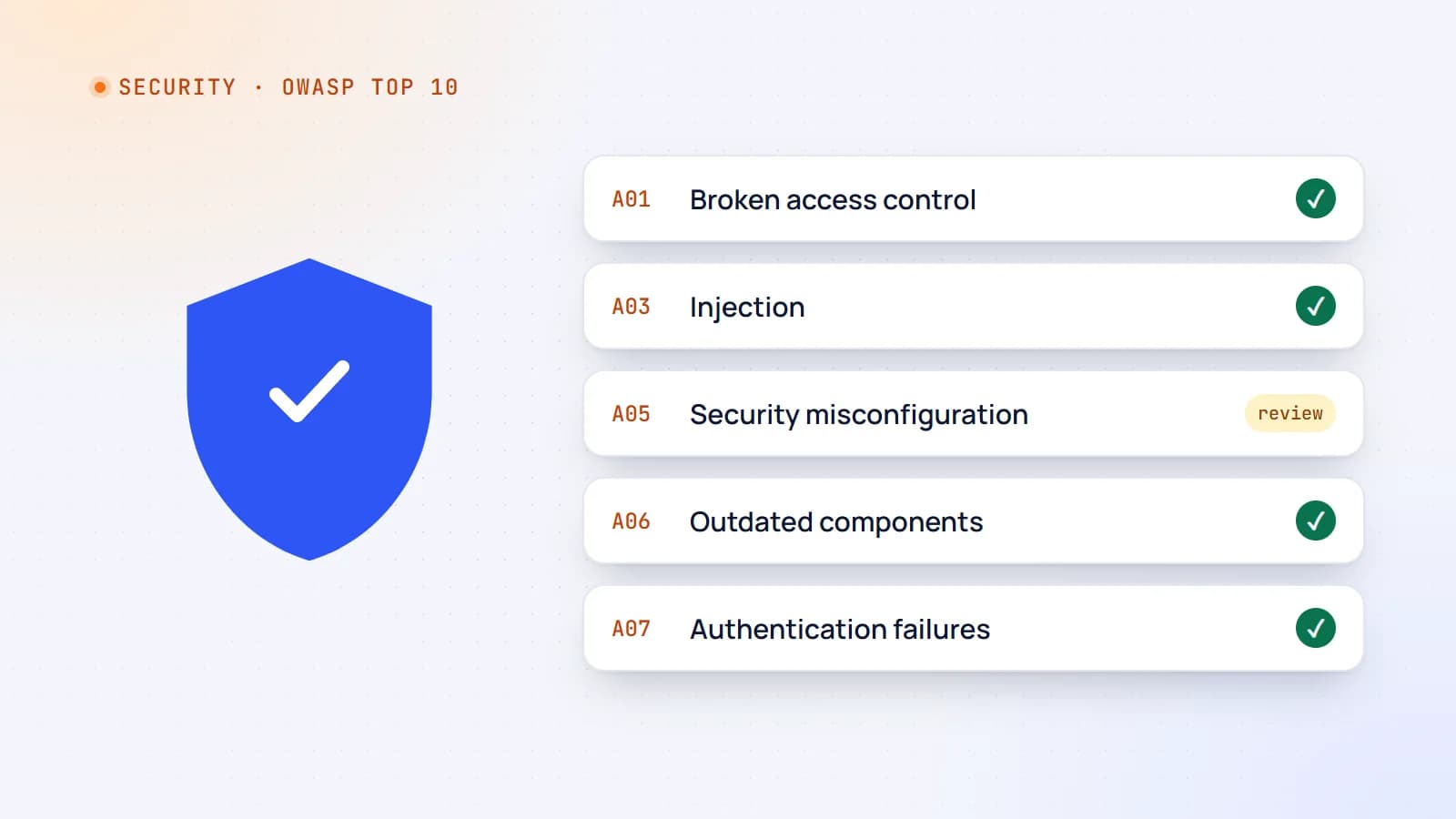
Web security essentials: the OWASP Top 10 explained for developers
Most web breaches don’t need genius hackers — they exploit a familiar list of mistakes. Here’s a practical tour of the OWASP Top 10 risks, with concrete examples and the habits that prevent them.
- Security
- Web Development
- Node.js
- Code Quality
6 min read
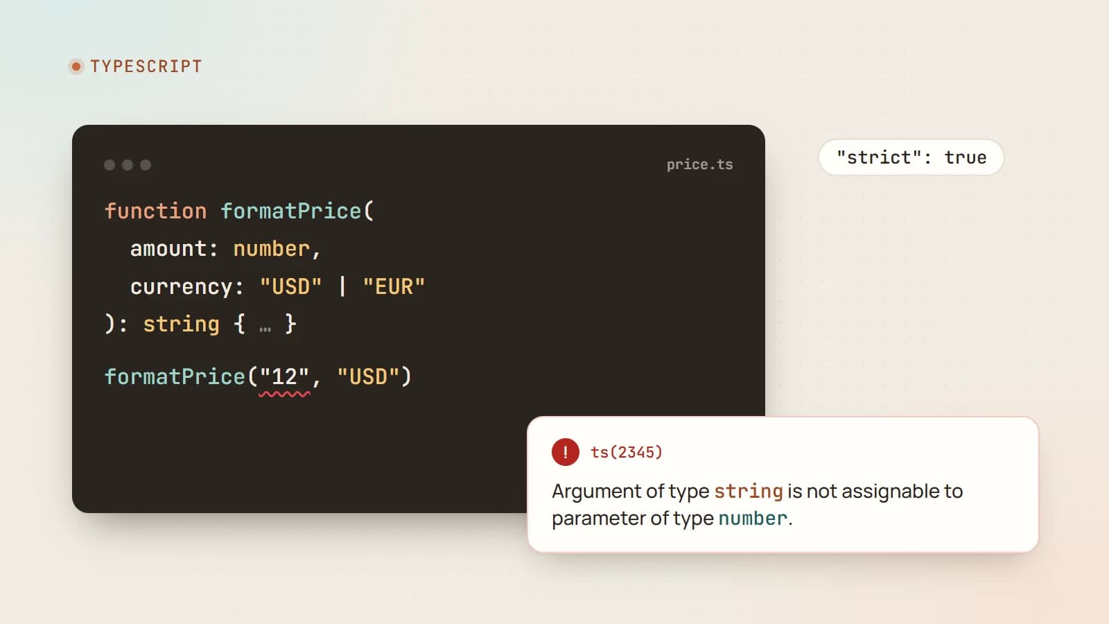
TypeScript for JavaScript developers: the parts that matter most
TypeScript catches whole categories of bugs before your code runs and makes large codebases far easier to change. Here’s a practical tour of the features you’ll use every day — and how to adopt it without slowing your team down.
- TypeScript
- JavaScript
- Web Development
- Code Quality
6 min read
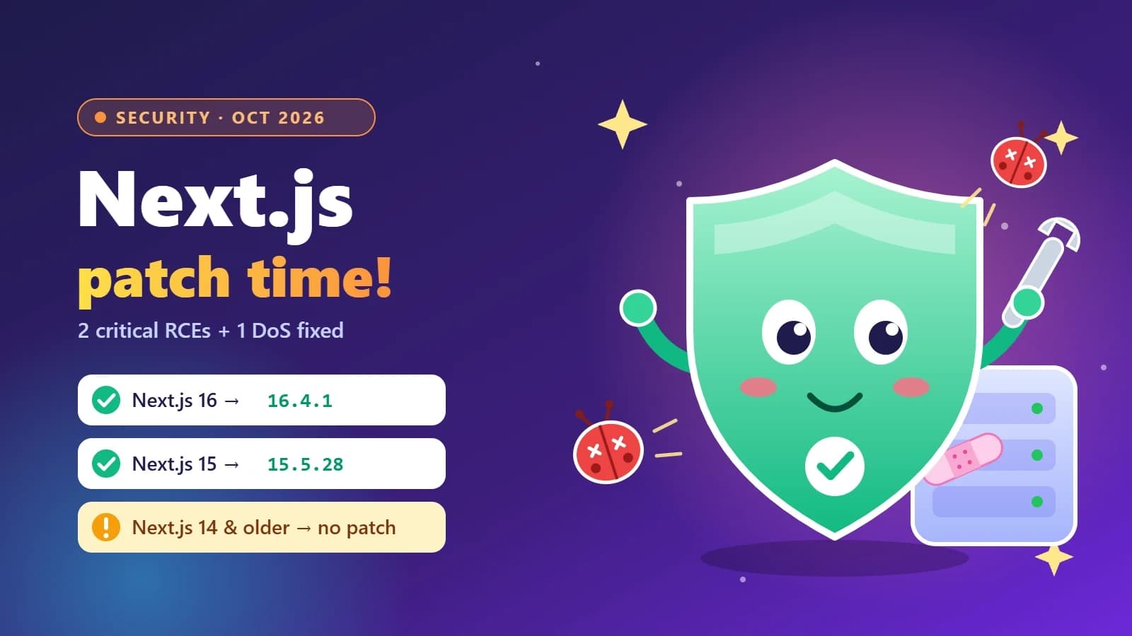
Next.js security update October 2026: which versions are vulnerable and how to upgrade
Next.js 16.4.1 and 15.5.28 fix two critical remote code execution bugs and a Server Actions denial of service. Here’s how to tell if your app is affected, how to upgrade safely, and what the November 3 security release means for you.
- Next.js
- Security
- Web Development
- Node.js
Building something? Let’s talk.
If you’re planning a web app, a website or a new feature, a free call is a good place to start — you’ll get honest options, a fixed price and a timeline.